
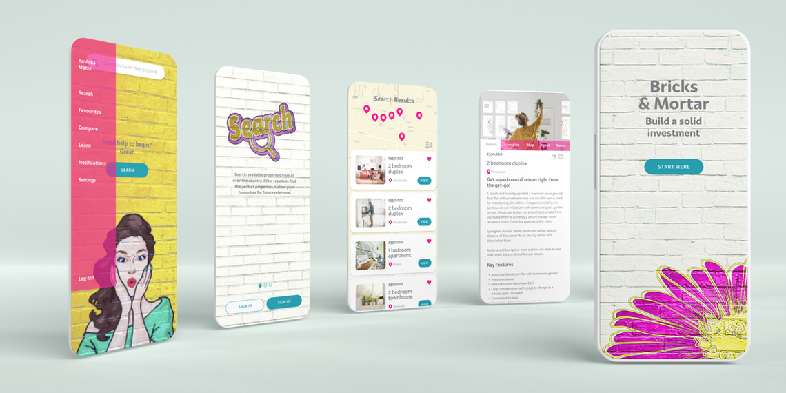
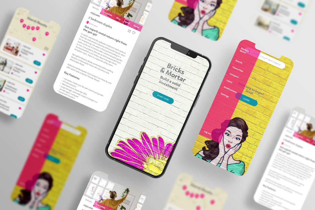
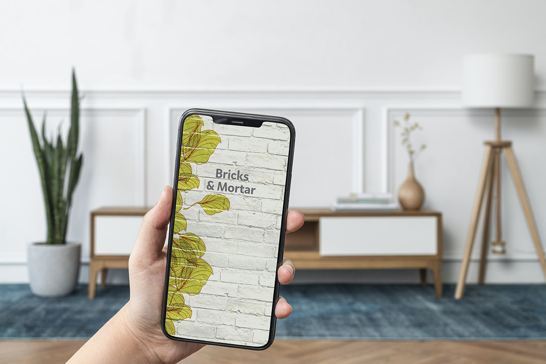
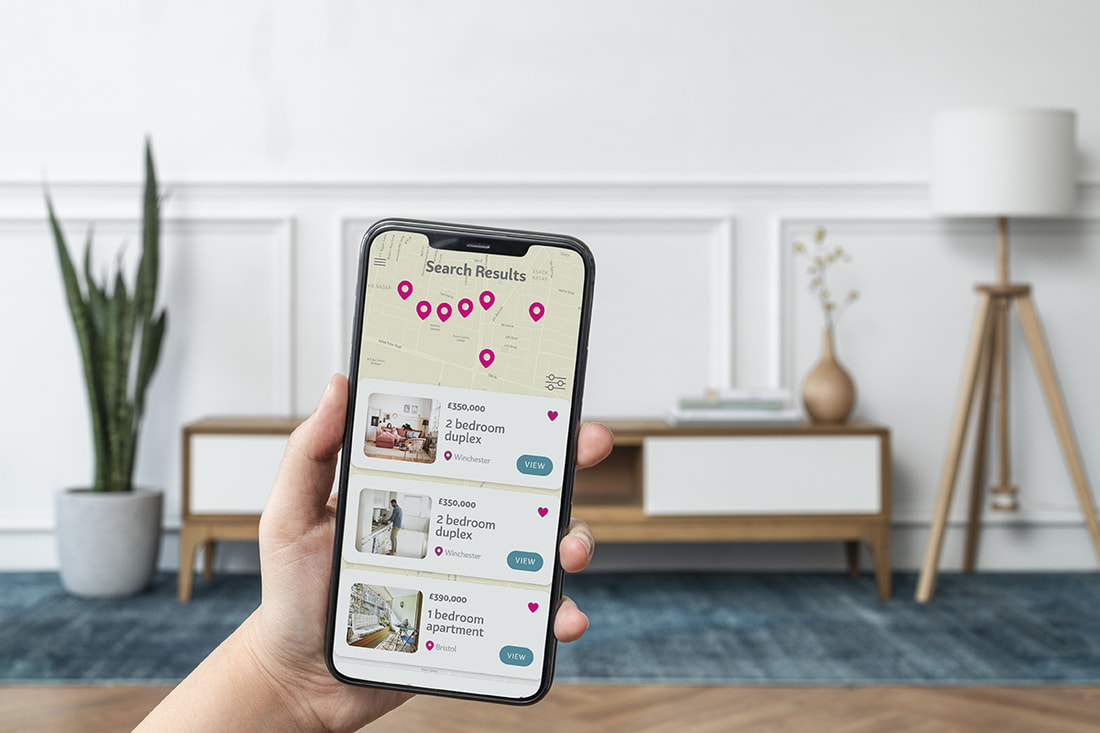
'Bricks & Mortar' UI for mobile, showing key screens
A Real Estate Investment Web App for First-time Property Investors
|
A design was required for a responsive web app to provide first-time property buyers with all the info they need to make sound property investment choices. Real estate investment can be complicated and first-timers may need professional guidance to avoid pitfalls.
S O L U T I O N The Bricks & Mortar app is designed as an easy and exciting way for investors to safely and efficiently conduct property searches in specific locations, assess property info geared towards investing, and to impart realistic impressions at a glance (without needing to visit in person). A visual identity and complete interface for desktop, tablet and mobile was created. |
M Y R O L E
|
T H E P R O C E S S
User Flow & Wireframing
|
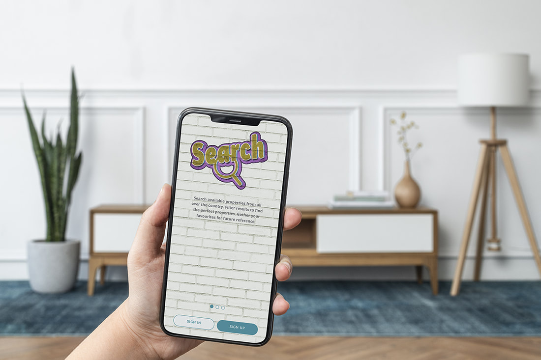
Beginning with UX Design I began work on the user flow. This was based on the needs of the user uncovered through user stories and the feature requirements provided in the project brief. A straightforward onboarding explains the three main functions: Search, Compare and Learn. As you progress through, simple headings and copy provide explanation.
|
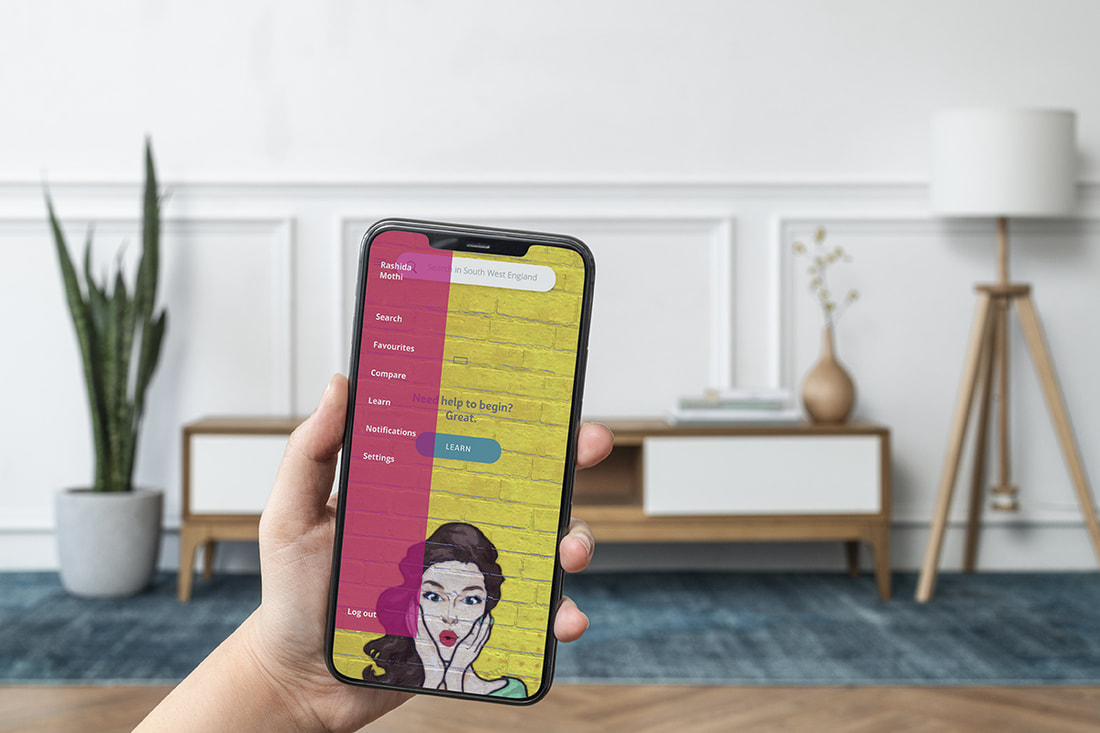
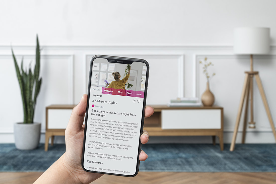
After sign up you begin your property search, you filter and compare results relevant to your investment criteria before moving on to access detailed information about a property. Finding property locations is easy with map directions. You can also chat directly to an agent, set up a viewing, or access relevant articles written specifically for first-timers, by professionals. Store observations as notes and photos to reference later.
|
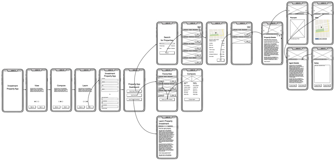
Low-fidelity wireframes for Bricks & Mortar created using Balsamiq provide logical flow toward completing your goals.
'Bricks & Mortar' Branding
|
My approach was wider and enabled me to add more value to the design process through branding and art direction. Through this, I was able to uncover additional insight, think more deeply, and ultimately develop a better solution for my users and for the business.
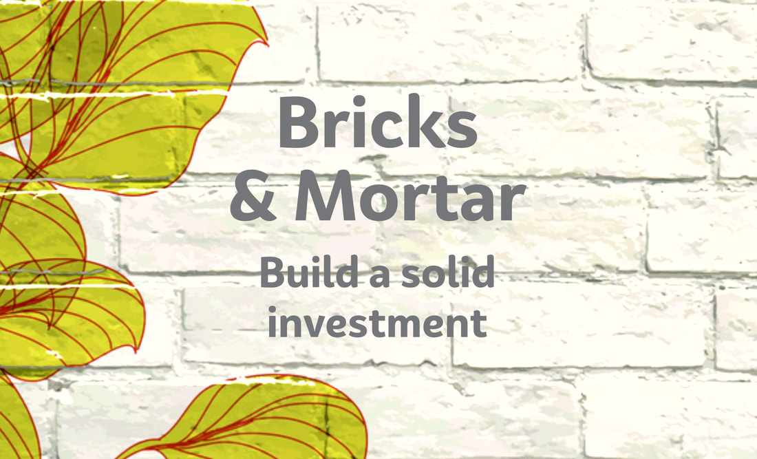
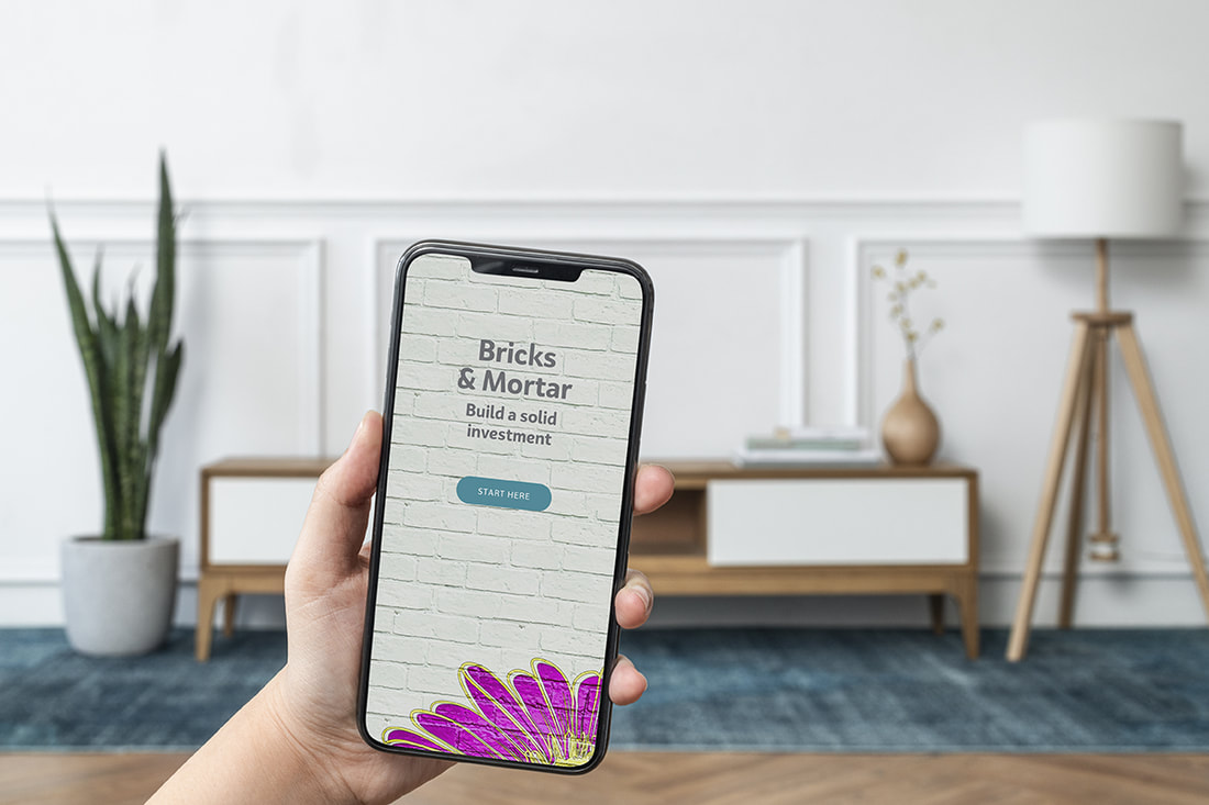
Brand Design Concept & NamingPositioning for the product was developed with a brand concept around the insight that buyers are ultimately motivated to 'build a solid investment'. This also lead to the 'Bricks & Mortar'' product naming.
|
|
I believe developing and reflecting brand values through a brand concept is a powerful way to influence a user's experience at the start of their journey. The product name 'Bricks & Mortar' and tagline ‘Build a solid investment’ impart brand values of stability, longevity, achievement & trust.
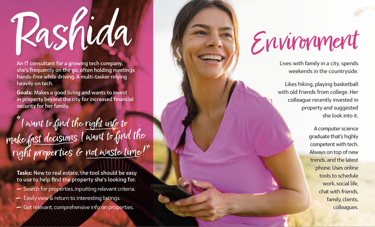
User Persona
|
A User Persona provides a way to bring a user to life, it enables their goals, pain points, and behaviours to be at the forefront of all design decisions. I referenced this Persona for Rashida as I progressed through the project which enabled me to refine my thinking and position the project on solving real problems for her.
|
Mood Board
|
Developed for our User Persons, Rashida, the moodboard introduces user interface design elements and informs the visual direction of the project. Embracing interior design trends with photos, illustrations, iconography, a solid but stylish rounded font adds feminine appeal and a contemporary, quirky colour palette adds excitement.
|
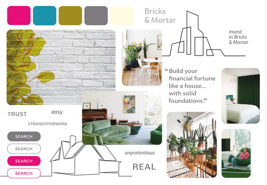
The story we aim to tell through imagery is one of security and confidence.
|
Photography
Natural light brings real-life mood with a 'sneak peak' into a room. Imagery is honest so properties feel attainable while art direction is contemporary and stylish. Indoor/outdoor themes that feature plant-life reflect trends and appeal to Rashida’s love of outdoors. Illustration
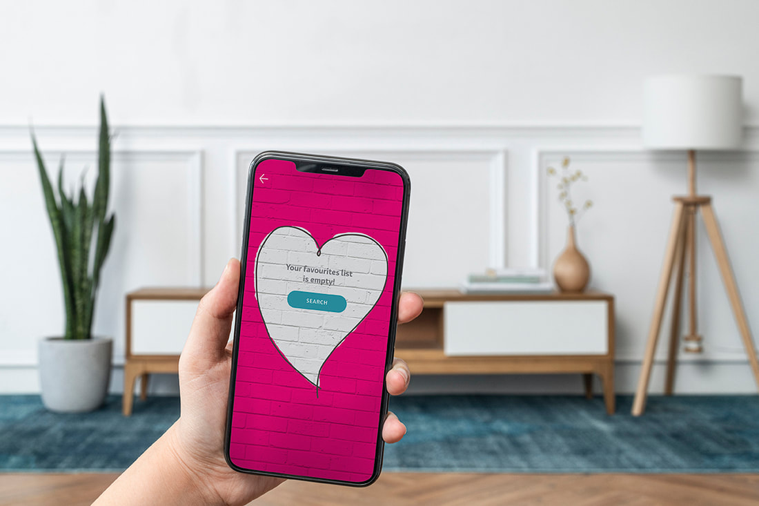
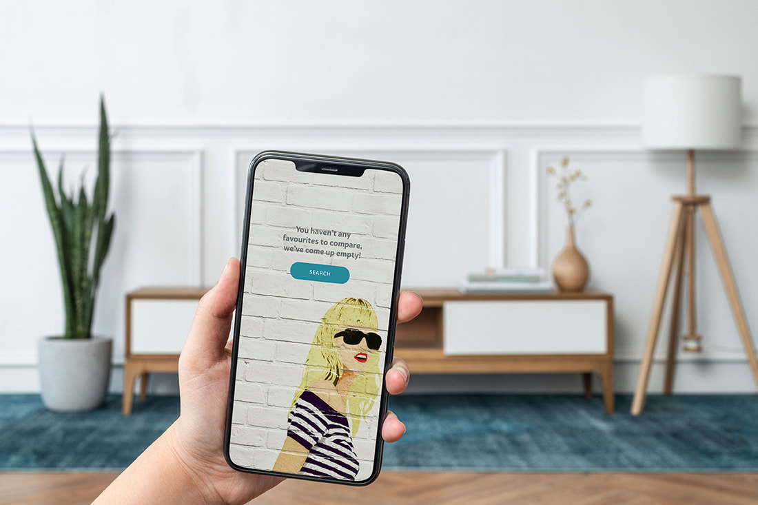
By adding ''graffiti' illustrations on to walls we add a creative edge to backgrounds with a Bricks & Mortar concept. Iconography, buttons & copy
Rounded images and buttons are friendly while outlined icons keep the design clean and clear. Copy includes terms like ‘safe’, ‘solid' and 'sound'. |
M O B I L E - F I R S T D E S I G N
Visual Design Elements
Going back to further refine my app's wireframes, I then redeveloped my low-fidelity wireframes from Balsamic into mid-fidelity Figma, adding UX copy, refining and enhancing visual design with a mobile-first approach. I integrated colour, illustrations and animation throughout screens to a high fidelity, detailing Interactions and gestures before fleshing out the design further to provide UI elements to be documented in the 'Bricks and Mortar' Style Guide shown below.
Interactions & GesturesInstruction was develop to specify engaging gesturesand ensure my app felt intuitive to users. This enabled replacing some otherwise on-screen controls.
|
|

Style Guide
|
The creation of a Styleguide for the product allowed me to document the UI I had created and provide a toolkit for future designers to reference for a consistent user experience.
|

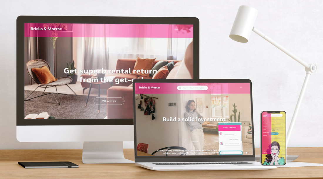
R E S P O N S I V E D E S I G N
Design for Desktop, Laptop, Tablet & Mobile
|
|
Supplying multiple designs for different breakpoints ensured that the product design integrity would stand up no matter the size of device users view it on.
|
|
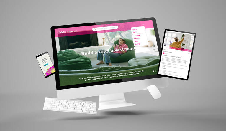
T H E F I N A L D E S I G N P R O T O T Y P E
|
Through understanding how the experience of investing in property might be from a user's perspective, the resulting 'Bricks & Mortar' app is unpretentious, straightforward, motivating and instils confidence in the user. All of the features are designed to be easy and enjoyable to perform, as well as represent an exciting and attainable way to reach financial security through property investment.
Thanks for taking the time to view my case study. |