
|
Yellowglen sparkling Wines
Six years of integrated brand advertising campaign, senior art direction
|
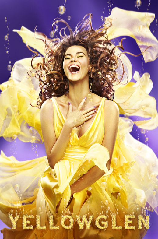
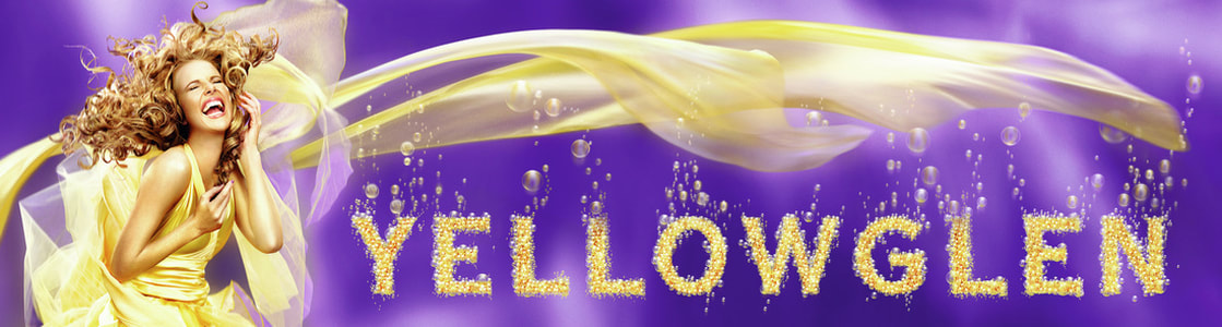
Yellowglen is targeted at women 21-25 who enjoy spending time with their friends and having fun. The Yellowglen brand embodies the exciting, approachable, inclusive and bubbly personality of the girl we all want to spent time with. As new Senior Art Director across the advertising brand, I was briefed to refresh the 'Bubbly Girls' brand campaign for the following year. After producing two additional campaigns over the folowing two years, the client introduced four sub brands to the Yellowglen family (Perle, Vintage, Jewel & Yellow). The challenge each time was to produce a fresh, highly memorable and visually arresting new take on the original 'Bubbly Girl' campaign idea for each new positioning. Through 6+ years of continuous single-minded brand advertising, Yellowglen sparkling wines came to own both 'Bubbles' and 'Bubbly Girls'. Our campaigns appeared in Australia, NZ, UK & Americas. An extensive array of integrated media included metrolites, billboards, supersites, shopperlites, eyelites, cinema, TVC's, product packaging, point of sale, posters, Melbourne Cup Carnival Flemington Racecourse 'take-over' and national train station 'take-over' campaigns. This also included 'The National Bubbly Girl Talent Search' campaign as well as various fun and 'bubbly' events which were not enjoyable at all... Hic!
Copywriter - Bill Hayes. Photographers - Juliet Taylor (Yellow), Chris Budgeon (Jewel), David Mandelberg (Vintage). Retoucher - Alan Perry.
Copywriter - Bill Hayes. Photographers - Juliet Taylor (Yellow), Chris Budgeon (Jewel), David Mandelberg (Vintage). Retoucher - Alan Perry.
|
|
National 'Bubbly Girl Talent Search' |
|
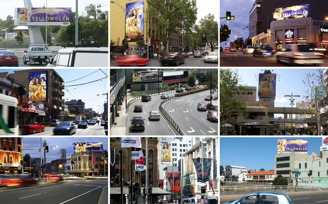
Metrolites, Billboards, Superlites, Train Station Takeovers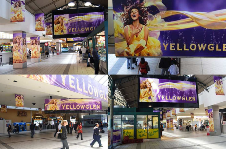
|
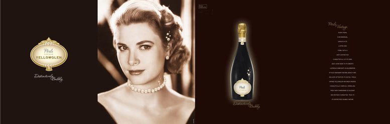
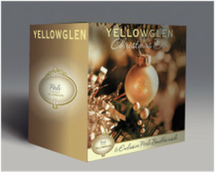
Sub-brand - Yellowglen 'Perle'
Yellowglen Perle is the top tier of Yellowglen Sparkling. The campaign idea was 'Distinctively Bubbly' and featured the most distinctive Bubbly Girl of all - Grace Kelly. Imagery was purchased from 'The Grace Kelly Foundation' and featured subtle retouched pearly bubbles. Magazine roll-fold executions told the story of her wedding dress sewn with a thousand tiny pearls. The campaign was executed through magazine, posters, metrolites, billboards, seasonal box & shipper packaging and point of sale.
|
|
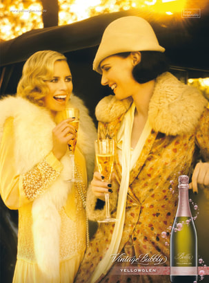
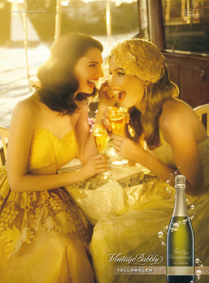
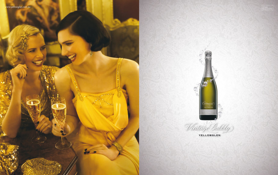
Sub-brand - Yellowglen 'Vintage'
Yellowglen Vintage Sparkling is a tier down from Perle and positioned for a slightly younger market. The campaign idea was 'Vintage Bubbly' which translates the Yellowglen Bubbly Girl concept with more subtle bubbles and vintage wardrobe and props. Locations were Art Deco inspired and included a vintage car and a vintage 50ft Yacht we took out on Sydney harbour at sunset - very special! Execution was through single & double page spread magazine, metrolites, posters, point of sale as well as a 'retro movie' digital animated banner campaign.
|
|
|
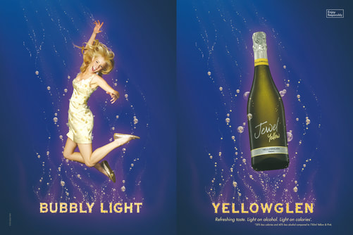
Sub-brand - Yellowglen 'Jewel'Yellowglen Jewel Yellow is low joule and low alcohol. The campaign translates the 'Bubbly Girl concept to a new demographic as healthier and more energetic with the line 'Bubbly Light'. The shoot involved jumping on a trampoline and was a lot of fun! Executed through double page spread magazine, metrolites, posters and point of sale.
|
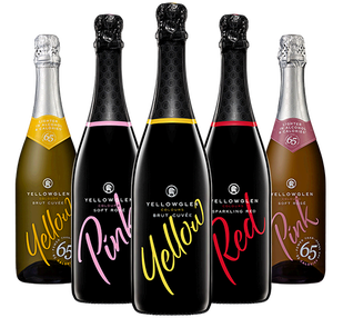
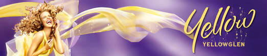
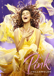
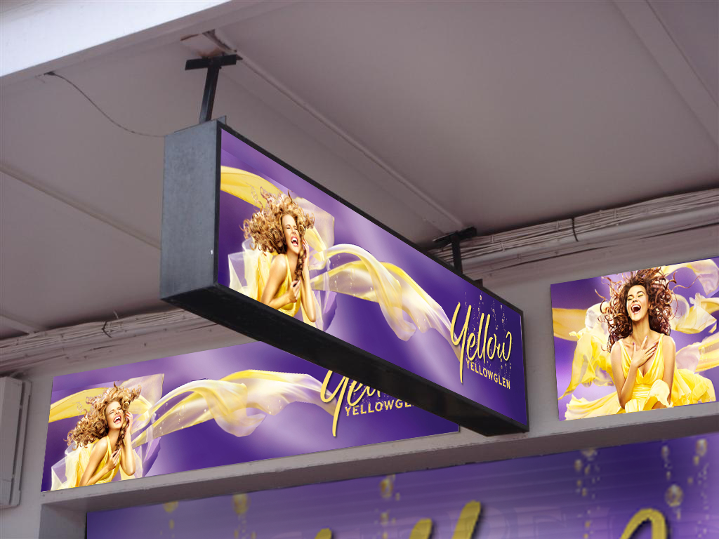
Sub-brand - Yellowglen 'Yellow', 'Pink' & 'Red'This execution continued with existing brand assets for a following year. After many iterations a fresh typographic twist was chosen which is still used today. Initially trialled on new international markets (UK & Americas), this campaign was executed across metrolites, freeway supersites, billboards, posters, point of sale and wine box shippers.
|
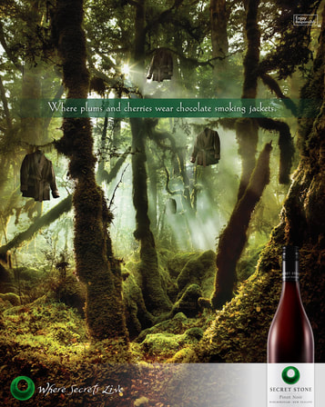
Secret Stone Wines magazine campaign with digital
Integrated advertising involving concept development, art direction, digital design & retouching
Campaign Idea
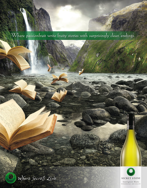
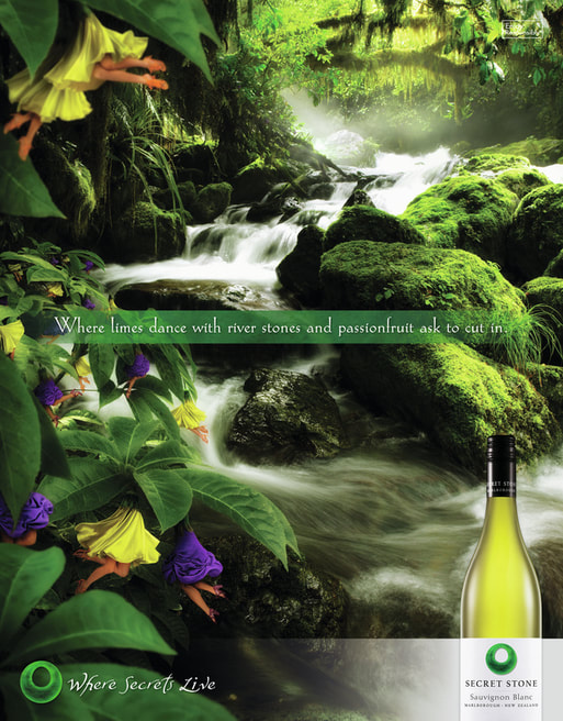
'Where Secrets Live'
'Where Secrets Live'
TWE wanted their New Zealand's Secret Stone Wines brand to appear as if it came from a boutique winery. The insight was that wine drinkers are always looking to discover something new and exclusive. The 'Where Secrets Live' advertising concept Bill Hayes (Writer) and I developed encouraged exclusivity, and the perception that the wine is from a mysterious and magical place. After producing detailed retouched layouts with images from Getty, I accompanied NZ photographer Matt Blamires and our client to shoot in beautiful remote locations in the South Island. I was 6 months pregnant at the time and it was quite an adventure to reach some locations in driving rain and sleet! The week long shoot was a real team building exercise and I had to think on the fly to create revised layouts for the wild terrain and weather conditions each day. The idea used wine descriptors to build the storytelling in the headlines and the campaign was executed across magazine, various digital advertising formats, metrolites, posters & point of sale.
Copywriter - Bill Hayes. Photography - Mat Blamires
Copywriter - Bill Hayes. Photography - Mat Blamires
|
|
|
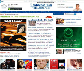
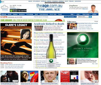
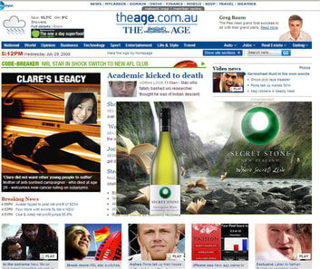
Expandable Mrecs (stages left to right)
|
|
|